Navigation and Profile Page Redesign
On our quest to improve usability, we’ve been tuning various parts of OBS. This time, we’ve worked on the navigation and redesigned the profile page. All of this is available in the beta program, so be sure to join if you haven’t done so already!
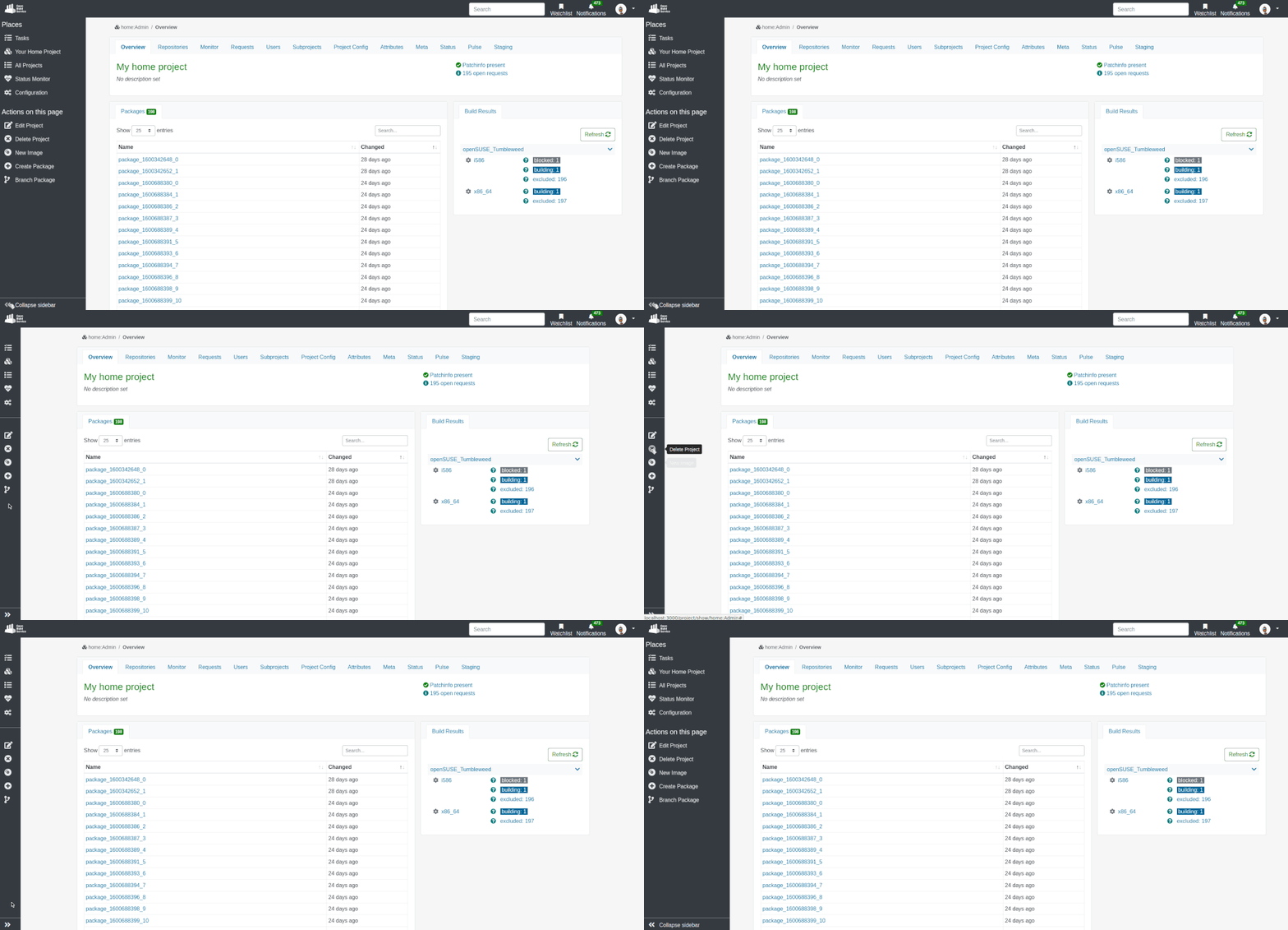
To Collapse, or Not To Collapse?
Well, this is the choice you have now with the left side navigation. We believe this will increase usability for anyone using OBS on devices with smaller screens.

Those changes were implemented after gathering feedback following up the release of our previous blog post on the left side navigation.
Whole Lotta Love for the Profile Page
All you need is love… this is definitely what the profile page needed! With this new design, the page looks much nicer on all devices, especially on those with smaller screens.
Ever wondered how a user is involved in projects or packages? This is a lot
easier to find out now with the reworked Involved Projects/Packages tab.
Simply use the Role filter and voilà, you know if they are the maintainer,
reviewer or more.
In addition to your avatar, the new biography field allows you to personalize your profile page with a short text. Be creative, the sky is the limit!
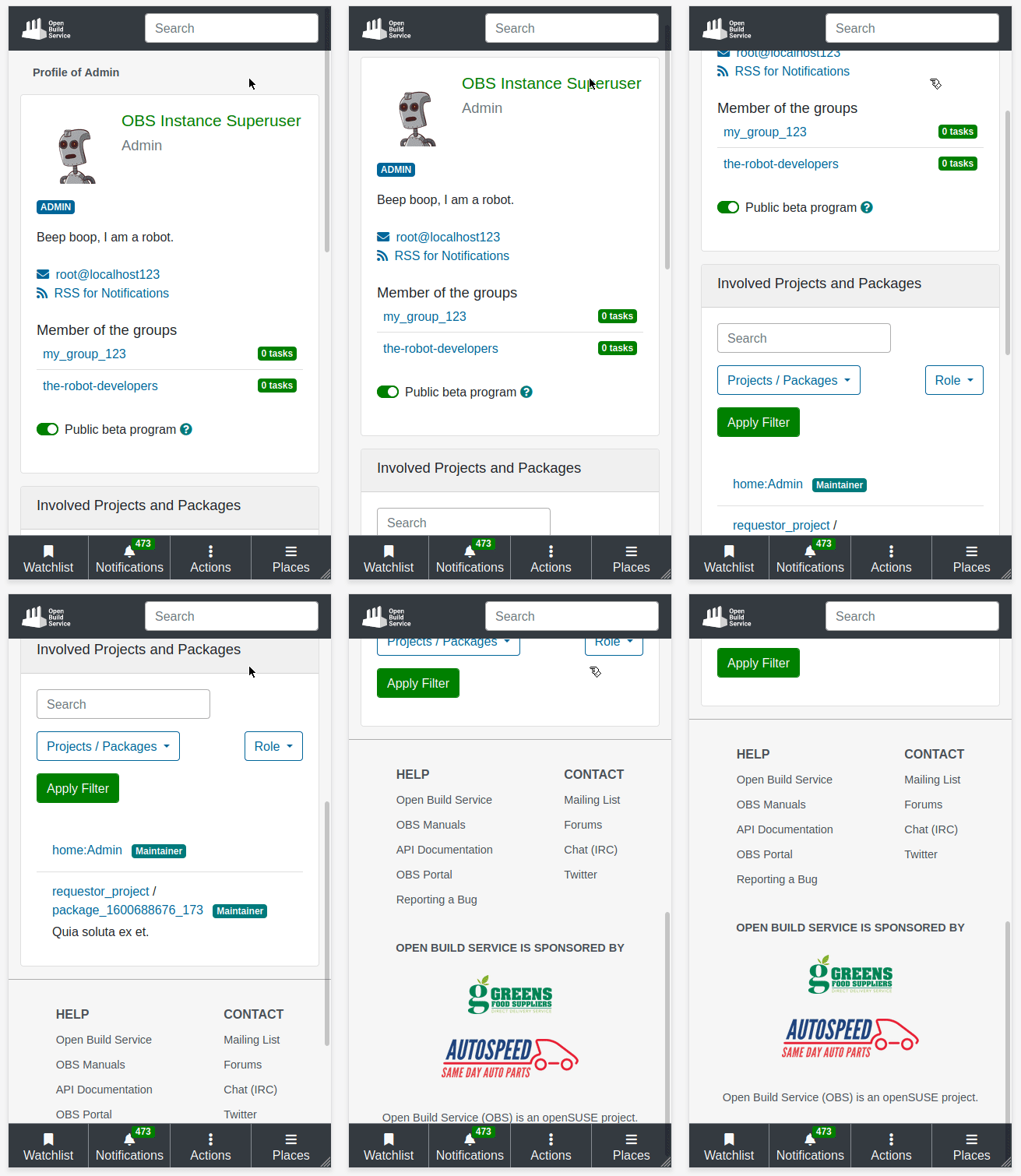
Here’s how it looks on mobile:

How To Give Us Feedback
There are two ways to reach us:
- On GitHub, by opening an issue and / or commenting on an already opened issue.
- On IRC, by talking directly to us. We are in the channel
#opensuse-buildserviceon Libera.Chat.
Please note that we favor GitHub to gather feedback as it allows us to easily keep track of the discussions.
