Fresh Notifications and much more
One more time we direct our effort to responsiveness, there is a lot to do in this regard and we are proud of our achivements during the last weeks. We heard your feedback and improved the navigation and we have a couple of new things to notify you about… go on reading.
Clarity and Consistency
One of the most relevant changes we have introduced for responsiveness is the navigation inside OBS. On smaller screen sizes a menu is displayed at the bottom of the page, for larger ones the menus are at the top right now. As icons were not meaningful enough by their own, we have gone a bit further and added a description to all the navigation elements for clarity and consistency.
On small screens:
![]()
On larger screens:
![]()
Menus, Menus Everywhere!
Previously we have created a menu for links to places such as your profile or your home project.
This menu now got its own fancy name and it is Places.
We wanted to explore this concept further by going through pages and grouping up things like creating or branching packages, editing project information and other actions. So instead of having them all over the page, we conveniently organized them together into another menu, this new menu got a quite original name… it’s the Actions menu.
For now, we have introduced the Actions menu for the homepage and the project overview page. Other pages remain unchanged for now. Let us please know what you think about this.

In-place Editing for Basic Information
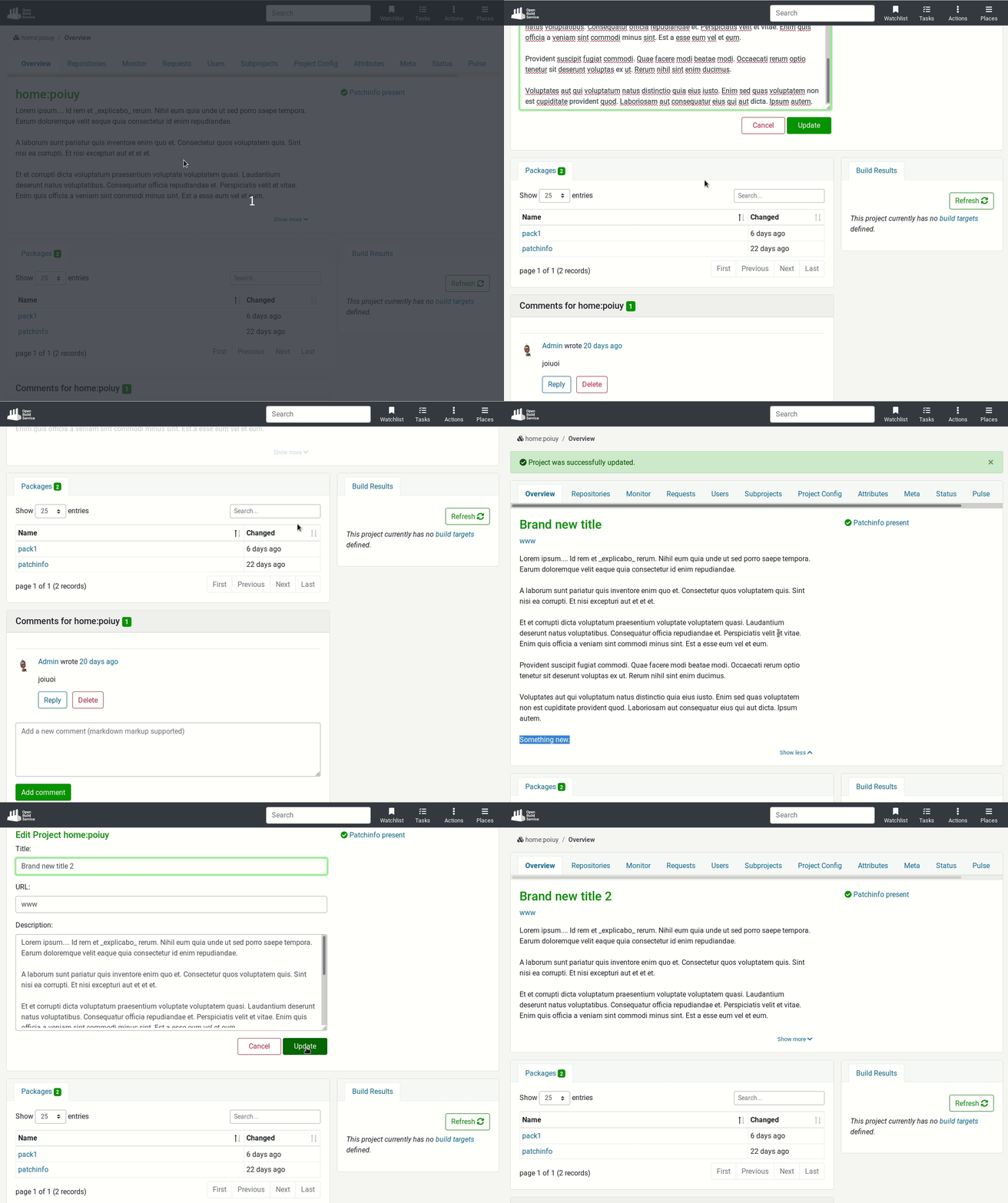
One of our goals has been replacing modal dialogs by something more suitable for small and touch enabled devices. Of course some modals are going to stay, specially those used to warn that something serious is going to happen, like deleting an element. Whereas other modals are going to be replaced.
This time we removed the modal for editing basic information like the title, description and URL of the project. We decided to replace it by in-place editing. Clicking on “Edit project” replaces the static content by a form without moving to another page, just in-place.
Notifications
On to the new thing we promised above!
We are redesigning the OBS notification system. So far you can find on the “My tasks” page a collection of OBS requests where you are somehow involved in.
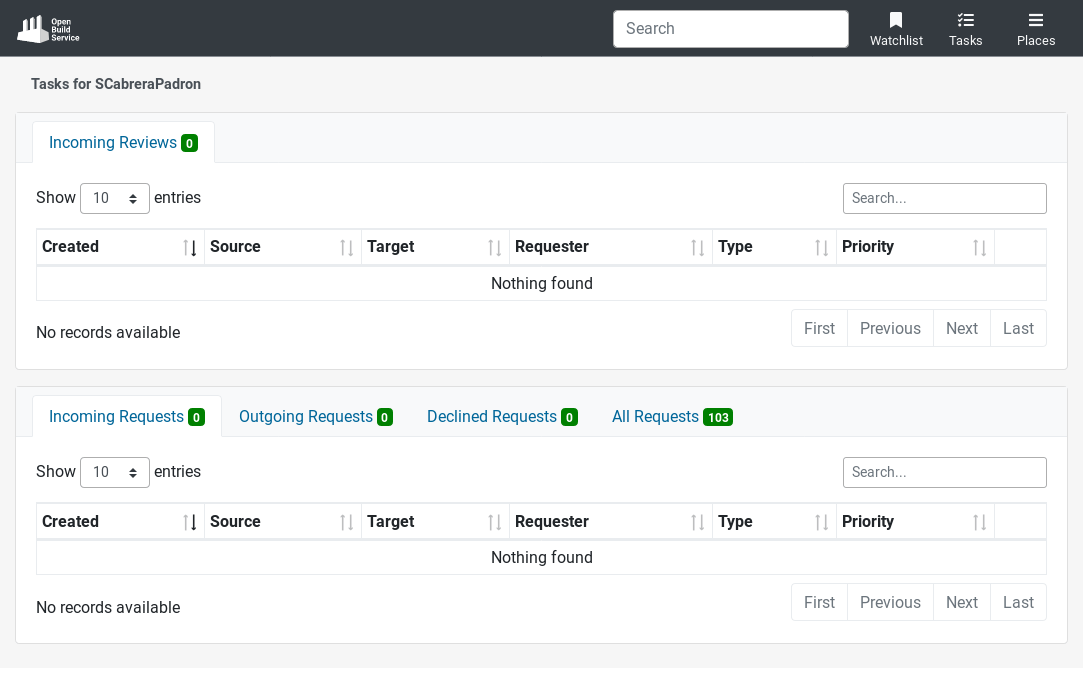
We wanted to change this work flow into something that feels more like a TODO list. Where different kind of notifications are displayed about things you have to act on. Like someone mentioning you in a comment, a review that is requested from you, or changes to the requests you are involved in. To give you a better overview about what must be done!
This is how the Tasks page looks now
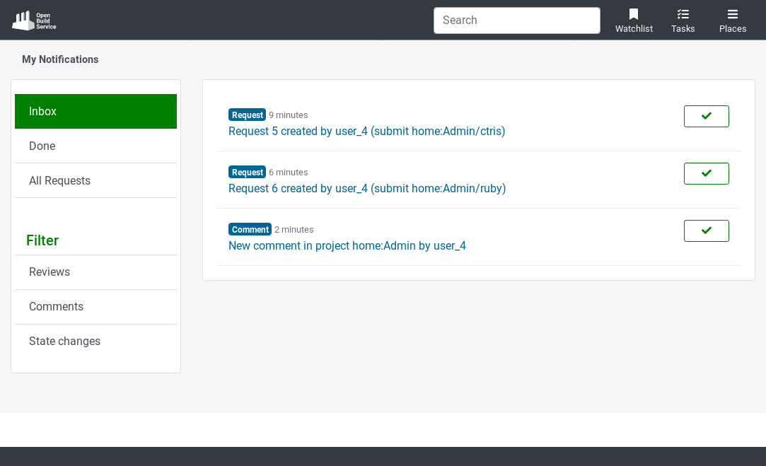
It shows a list of all kind of notifications and, using the button on the right, you can mark them as “Done” as soon as you acted on them. On the left side there are different options to filter notifications: The Inbox option shows all your new notifications. The Done option shows only those which were already tackled. And the All Requests option still shows all the requests you are involved in. For further filtering you can use the options in the Filter section as well.
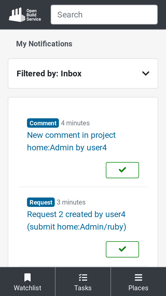
Of course, it also works fine in small screens, this time with the options collapsed on the top.
Keep on scrolling
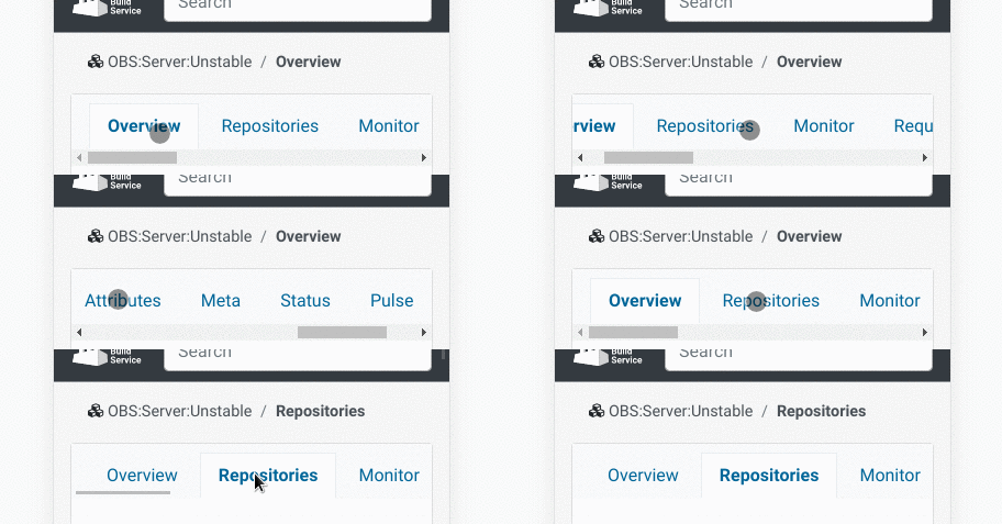
We all know it, we all using it. Scrollable tabs are nothing new on mobile devices. So why not taking advantage of them, and use such an widely and established control element in our own webui? After some research, we got convinced to do so.
Try It out and Give Us Some Feedback
If you haven’t done it already, please join the beta program, try the new features and tell us what you think about them.
There are two ways to reach us:
- On GitHub, by opening an issue and / or commenting on an already opened issue.
- On IRC, by talking directly to us. We are in the channel #opensuse-buildservice on Libera.Chat.
Please note that we favor GitHub to gather feedback as it allows us to easily keep track of the discussions.
