OBS Is Revamping Its User Interface, Help Us to Make It Awesome
This is part 1 of a series of posts about revamping the user interface of OBS. We started off with the Package pages in October 2018, moved on to the Project, User and Group pages in December 2018, continued with the Request pages in February 2019 and migrated the Configuration pages in March 2019. We then finished the Maintenance pages in April 2019, the Search and Kiwi Editor pages were completed in May 2019. In June 2019 we focused on the Cloud and Monitor pages. The whole migration was finished in September 2019, bye bye bento!.
We have kicked off the migration to a new user interface for OBS. We started with the homepage and the package pages.
Here is a comparison of the new and old user interface of the package overview page:
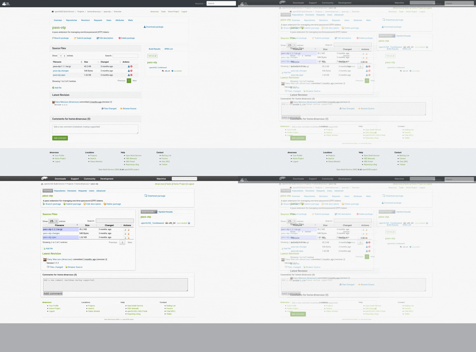
We need your feedback to make this even better! We are looking for:
- Bugs, so anything breaking workflows.
- Design feedback, so anything related to the user experience and interface.
- How it works on your device / browser.
Keep in mind that at the moment, we are migrating to the new technology, but without making significant design and workflow changes. It would be really confusing for everyone, if from one day to another, we changed the whole interface. For this reason, design and workflow changes will be progressively introduced, only after the migration is completed and the new user interface is enabled for all users.
How Give Us Feedback
You need to join the beta program on OBS if you haven’t already.
There are two ways to reach us:
- On GitHub, by opening an issue and / or commenting on an already opened issue.
- On IRC, by talking directly to us. We are in the channel
#opensuse-buildserviceon Libera.Chat.
Please note that we favor GitHub to gather feedback as it allows us to easily keep track of the discussions.
Why Are We Revamping the User Interface?
We refresh the whole UI to improve your user experience. It includes:
- Improving consistency among the application.
- Responsive pages, so you can use OBS on phones and tablets.
- Modern look and feel.
On top of this, there are benefits for developers and contributors too:
- Improved code consistency, readability and ease of maintenance by using Bootstrap’s excellent components and utilities.
- Reduced unnecessary technical complexity, effectively helping us in fixing bugs and adding UI-related features.
It’s a win-win situation for all OBS users, developers and contributors.
The New Pages
Let’s take a tour together to go through the major changes. You will see, the package pages in the new UI look great!
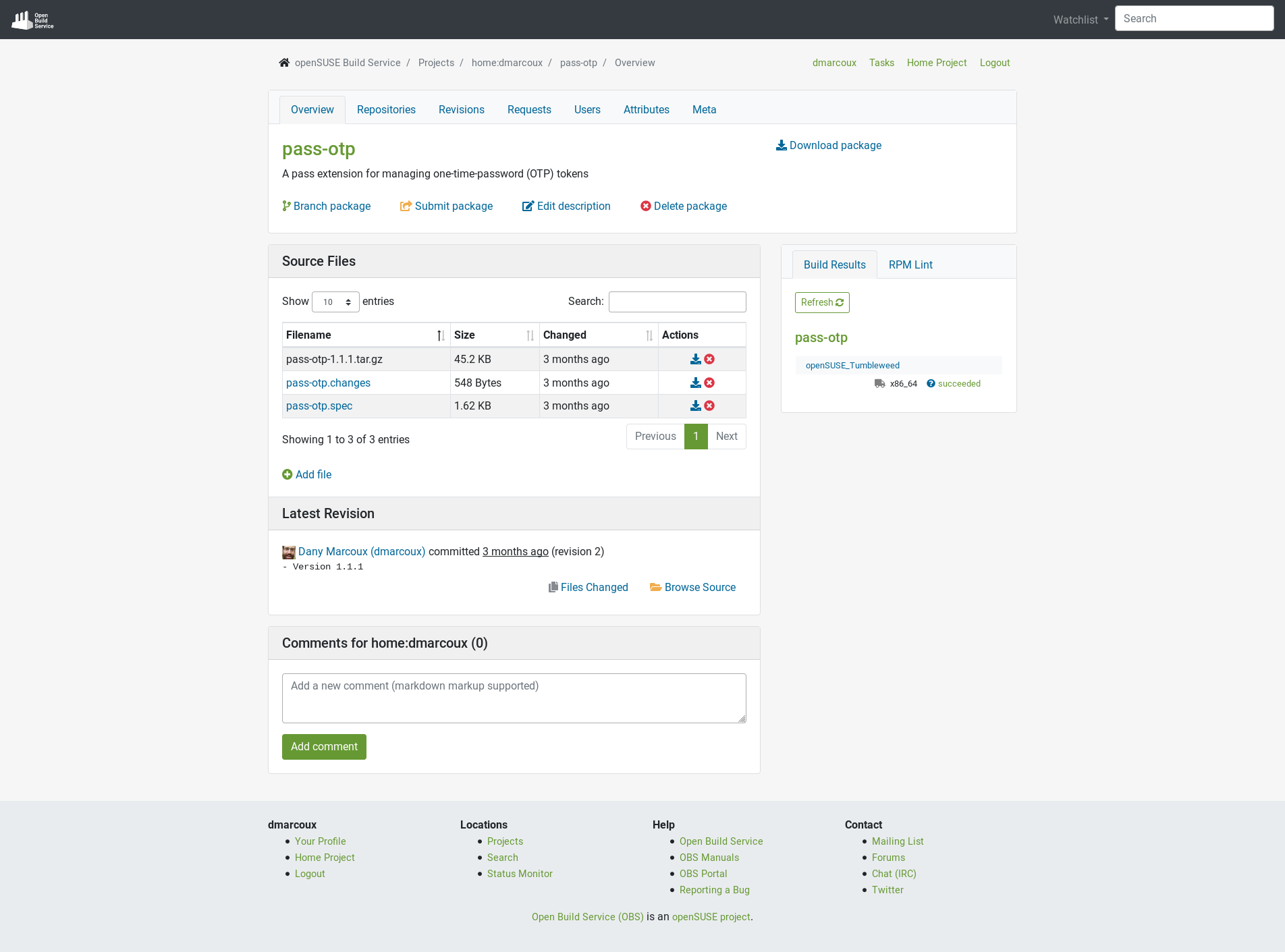
The overview of a package:
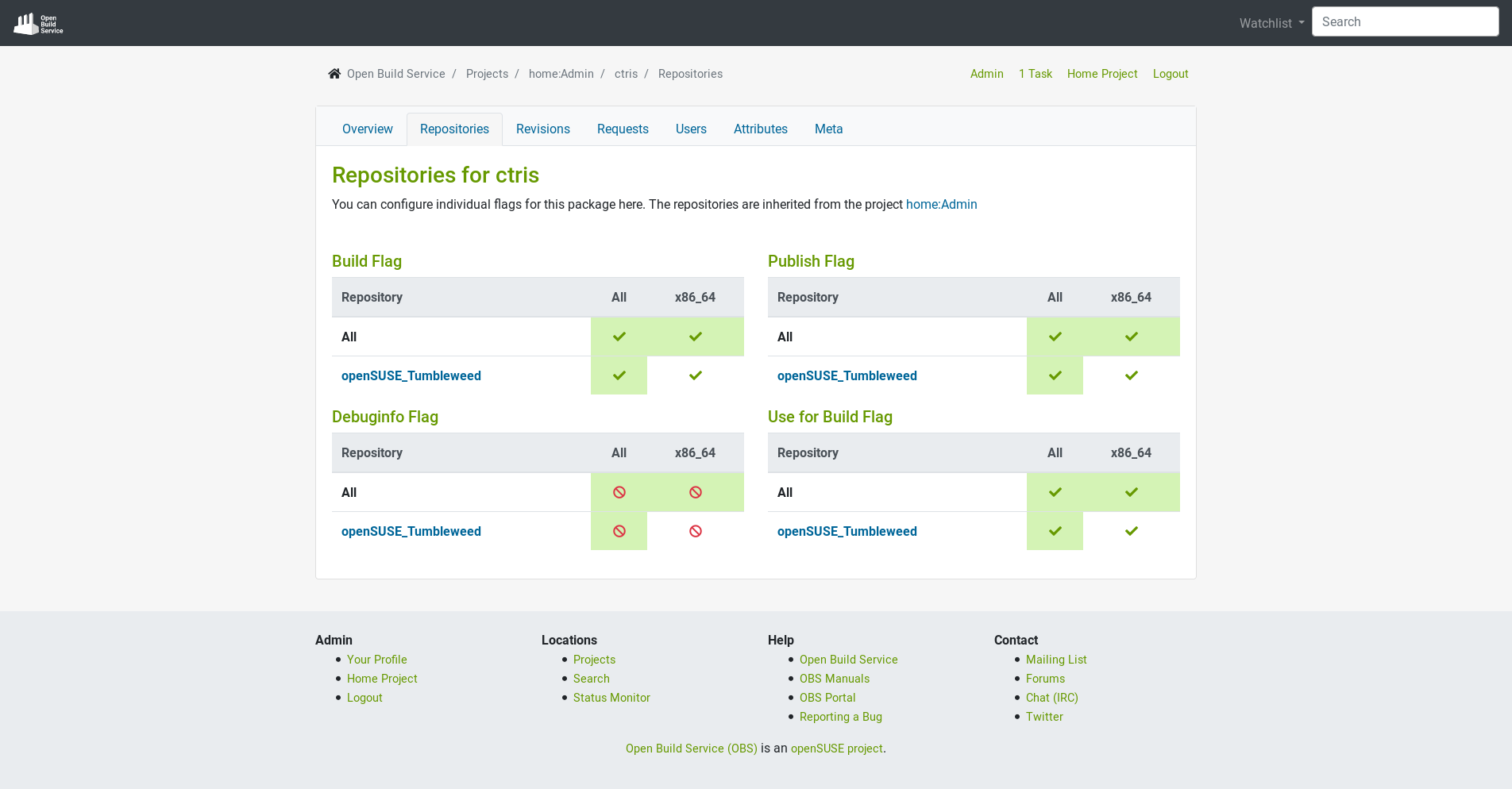
The repositories configuration for a package:
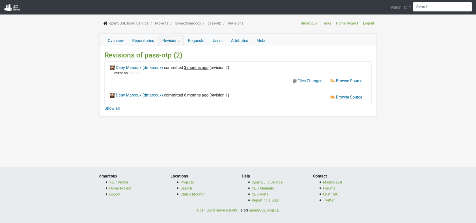
The revisions of a package:
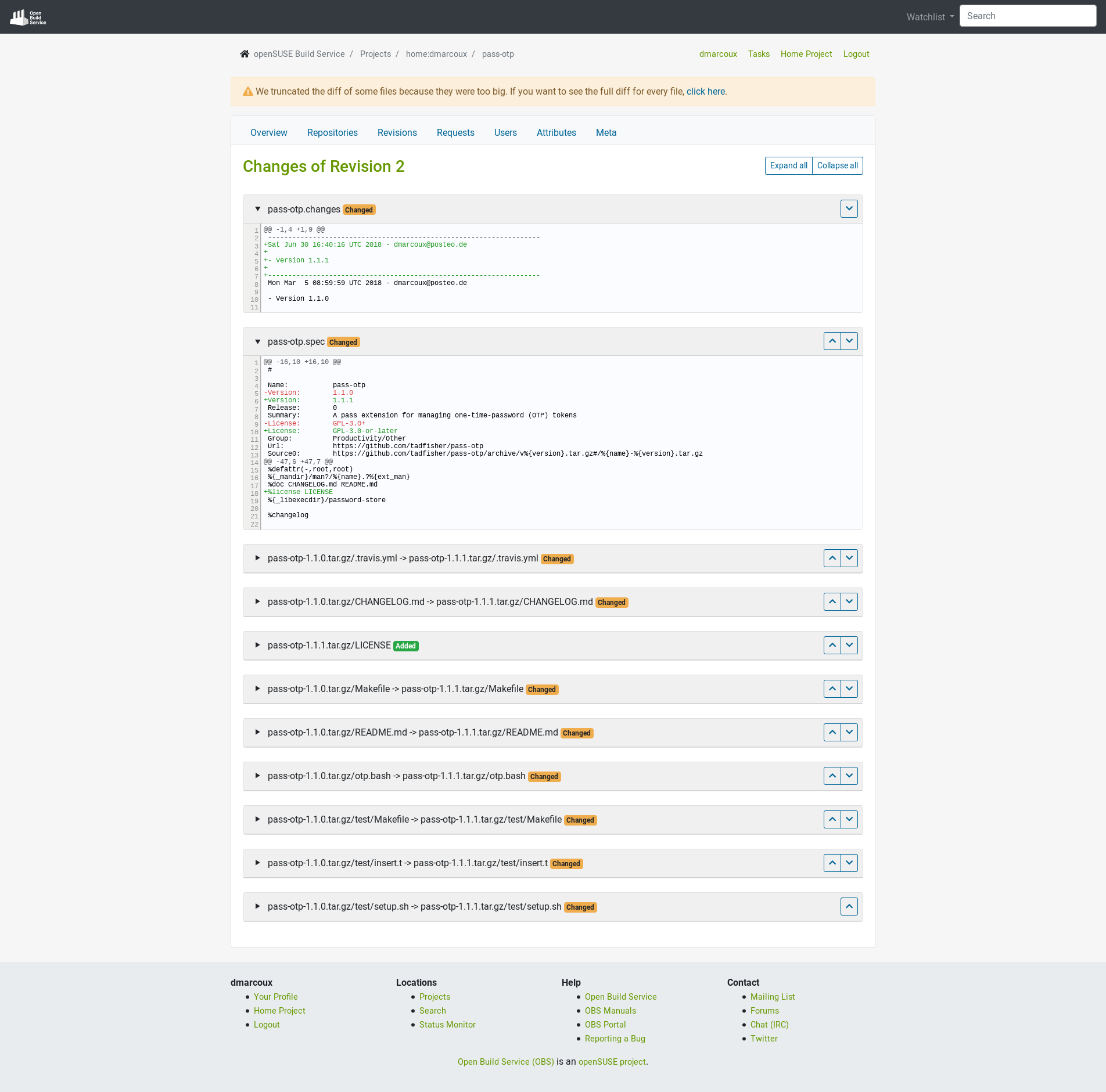
The changes of package’s revision:
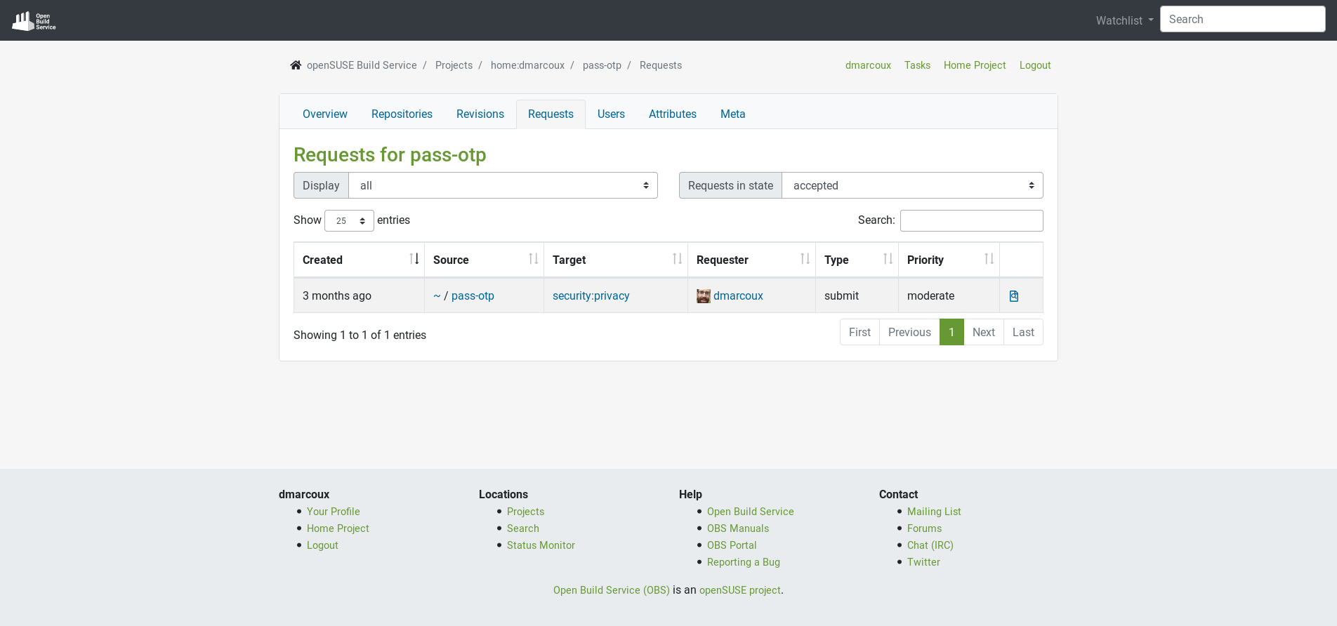
The requests for a package:
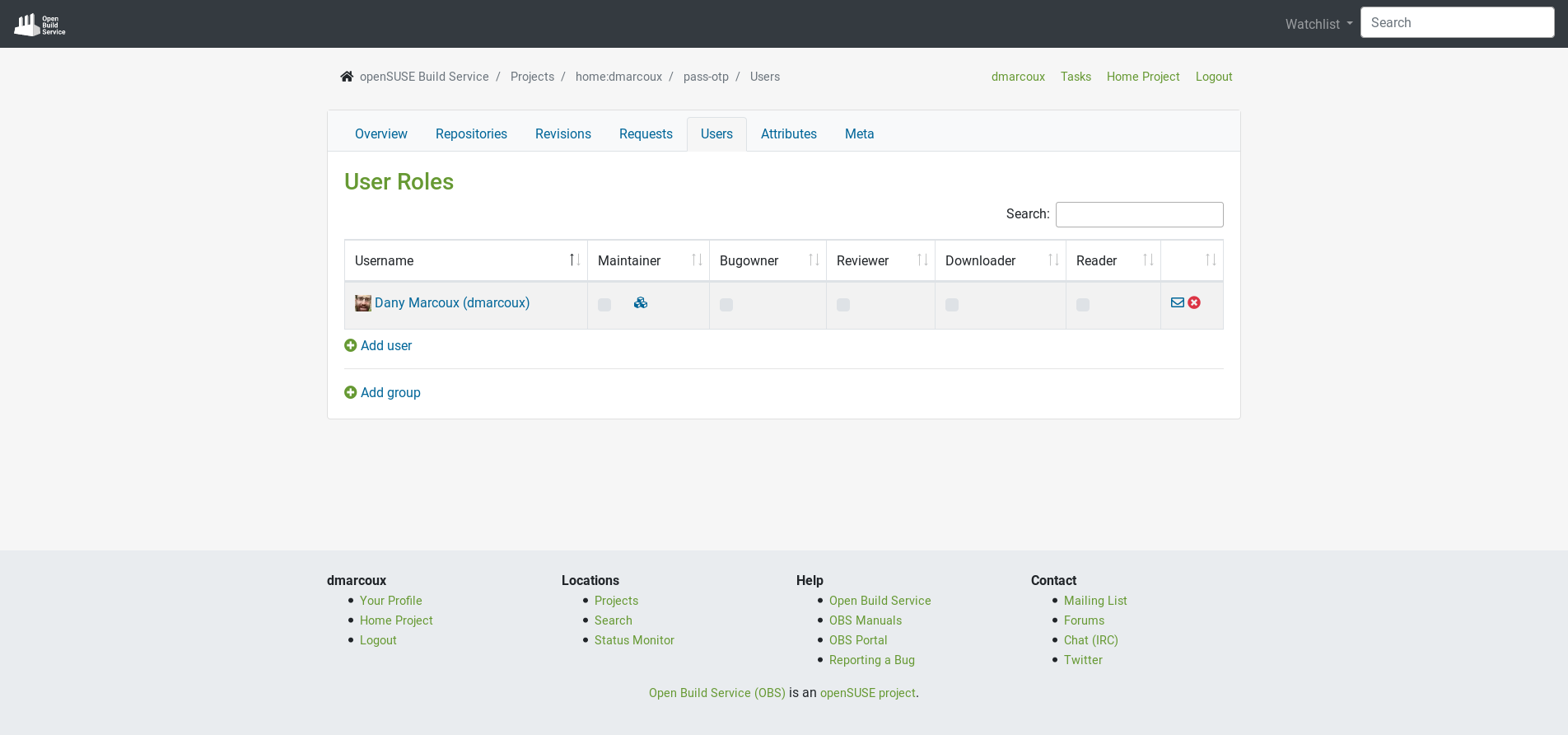
The users of a package:
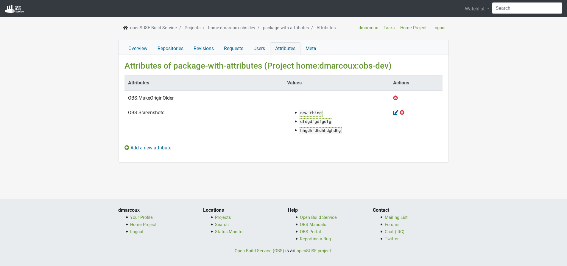
The attributes of a package:
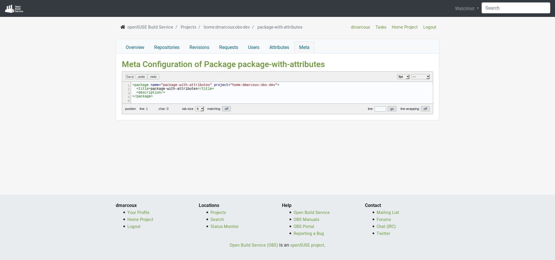
The meta configuration of a package:
What Is Coming Next?
We will be working next on the Project, User and Group pages. Stay tuned, we will inform you as soon as it is available in the beta program.
We are looking forward to hearing from you on GitHub and in the #opensuse-buildservice IRC channel on Libera.Chat!
